CSS Grid
Mental Model
In CSS Grid, our element's content box is sliced into rows and columns. The rows/columns don't have to be the same size, but they do have to be consistent. If a column is 250px wide, each cell in that column will share that width.


CSS Grid doesn't support zig-zag columns like this. Every cell in the same column needs to have the same width. The same is true for rows: every cell in the same row needs to have the same height.
We also can't end a row or column prematurely; If our grid has 2 columns and 3 rows, each column will have 3 cells.This sort of thing is illegal:

Every row needs to have the same number of columns (and vice-versa). We can't have a grid where the first row has 1 column, the second row has 2 columns.
Rows/columns are invisible markers
CSS Grid is fundamentally different, because the structure happens exclusively in CSS. There are no DOM nodes that represent the rows or columns in CSS Grid. Instead, the rows and columns are invisible markers, tools that our HTML elements can use to position themselves.
Rows and columns are like the lines painted on the ground in parking lots. Drivers can use these lines to align their vehicles, but really they're just symbols. It's up to the driver to decide how to use them.
This has been very abstract, so let's put it in concrete terms. Here's how we'd set up a CSS Grid to recreate a “Holy Grail” layout:
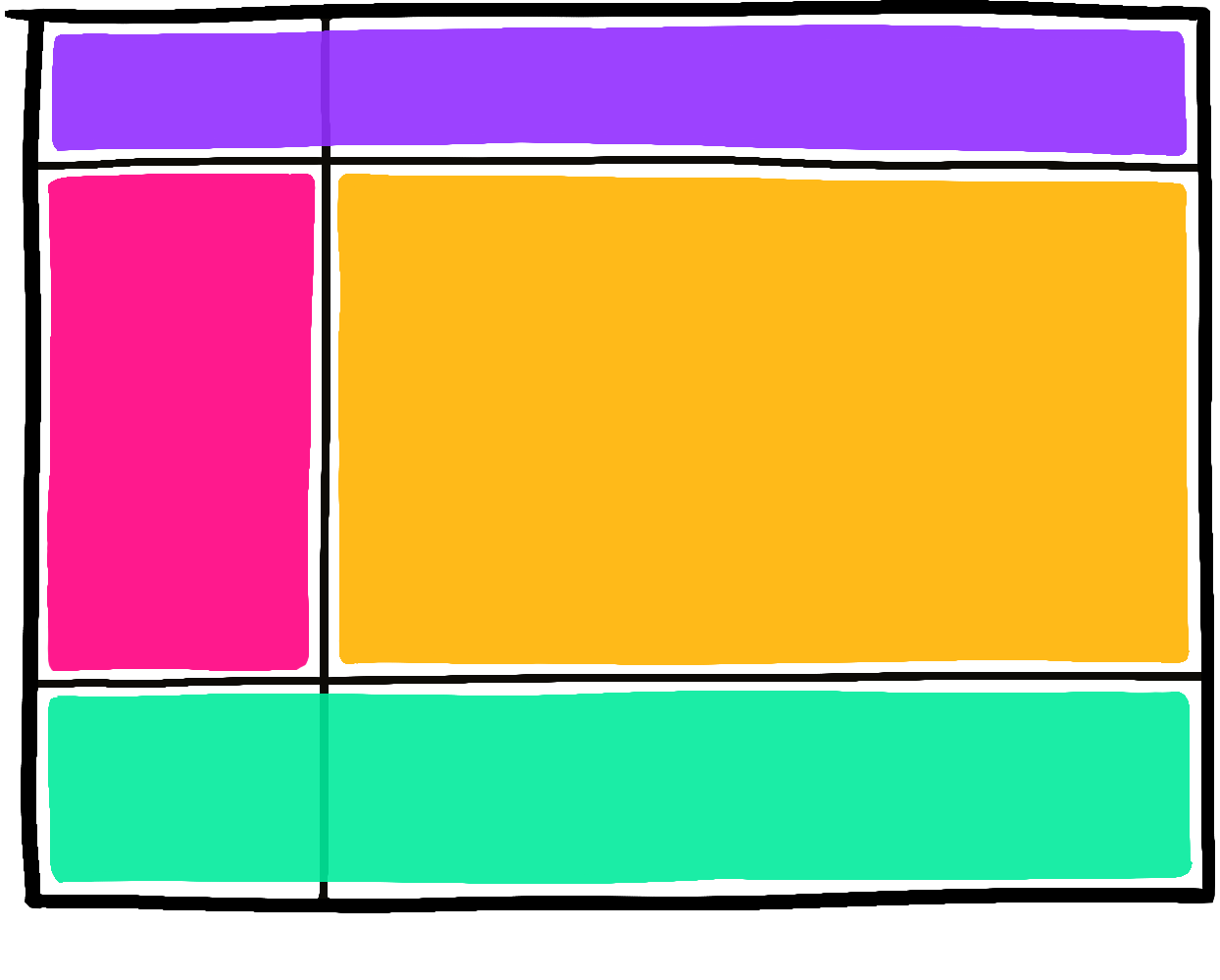
It looks almost the same, but with 1 critical difference—the first column stretches all the way from top to bottom:
The "parking lot" analogy works in a number of ways:
- Like the chaotic-evil driver who parks sideways and takes up 3 parking spots instead of 1, elements can choose to span multiple cells
- An HTML element can fit snugly in its assigned cell (like a truck that barely fits in the spot), or only a tiny part of it (like a Mini Cooper in an extra-wide spot)
- Cells can be totally empty! A parking lot with 50 spots might only have 1 car, in a seemingly-random spot
- A single grid cell can contain multiple children, like 3 motorcycles parked in the same spot.
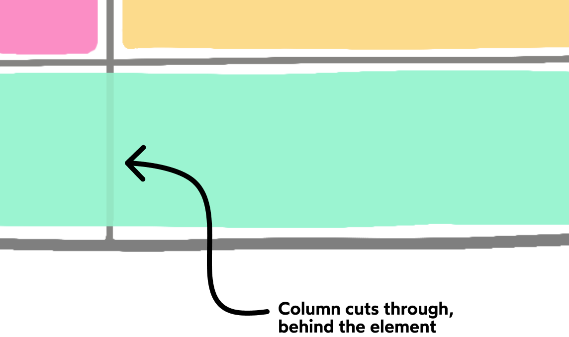
The thing that makes CSS Grid so powerful is that the grid structure can be selectively ignored. All kinds of cool layouts are made possible by this unique quirk, and we'll be exploring it throughout this module.
Inset grids
In the examples we've seen so far, 100% of the grid's content space is taken up by rows and columns. Technically, this isn't a requirement for CSS Grid.
Let's suppose that we create a grid with 4 columns that are each 100px wide. If the container is larger than 400px, we'll wind up with some "dead space" at the end:
 In practice, we rarely want to take advantage of this feature. It's usually simpler if our grids do span the entire area. I'm mentioning it here just to give you an accurate mental model, not suggesting that you should structure your grids this way.
Browser Support
It's not a bleeding-edge feature anymore! It was first drafted in 2007, and has had broad browser support since 2016.
If your applications target folks using modern browsers (Chrome, Firefox, Edge, Safari, and mobile browsers like Samsung Internet and UC Browser), you can use CSS Grid safely and without reservation.
If you need to support Internet Explorer, the good news is that IE 10 and 11 support CSS Grid! The bad news is that they implemented a slightly older version of the specification, so certain properties work a little bit differently.
But what if you need to support allbrowsers, including Opera Mini, a mobile browser with zero CSS Grid support (and about 1% of global internet traffic)? Maybe you work on "critical infrastructure", like a government website, or anything in the medical industry. In these circumstances, it's important for us to build a usable experience for everyone, regardless of browser choice.
We can do that with feature queries:
.wrapper {
  display: flex;
}
@supports (display: grid) {
  .wrapper {
    display: grid;
    grid-template-columns: 1fr 1fr;
  }
}
A feature query is similar to a media query. The CSS you put inside the @supports statement will only be applied if the browser recognizes the CSS declaration you pass it. If display: grid is a "legal" declaration in the current browser, the CSS will be applied. Otherwise, it'll be ignored:
@supports (display: spaghetti) {
  /*
    Any CSS put in this block will never be applied,
    because (at this time of writing) no browser
    has a "spaghetti" layout mode.
  */
}
What if '@supports' isn't supported?
Feature queries have been around for a while, and have very good browser support: about 98% globally.
But, what about that other 2%? Earlier, we mentioned that Opera Mini is missing CSS Grid support. It's also missing @supports support!
As it turns out, however, this isn't a problem.
Consider what happens when Opera Mini encounters this chunk of CSS:
.wrapper {
  display: flex;
}
@supports (display: grid) {
  .wrapper {
    display: grid;
    grid-template-columns: 1fr 1fr;
  }
}
Opera Mini understands Flexbox, so it can apply the first style. But then it hits @supports, and it has no idea what that is. So it skips that entire statement.
This is actually what we want! If a browser doesn't support feature queries, it probably doesn't support CSS Grid either. So we can stick with the standard, baseline experience.
It's a completely separate mechanism, but both roads lead to the same place.
There are some fundamental differences between Flexbox and CSS Grid. Sometimes, it won't be possible to use both, because the required HTML structure would be different (specifically, Flexbox sometimes requires nested DOM nodes).
You may find it easier to stick with Flexbox and create 1 layout for everybody, and that's a valid choice.
But I would encourage you to learn about CSS Grid, and try it out for yourself! There will come a day when 99.9% of us are using browsers that support CSS Grid.
Even if you don't adopt it fully now, it couldn't hurt to learn more about it!
Grid Flow and Layout Modes
Like Flexbox, we can enable the Grid layout mode with thedisplayproperty:
.wrapper {
  display: grid;
}
Here's what happens when we dump some stuff into this element:
This is known as an implicit grid. We haven't told the engine what the rows and columns should be, and so it's come up with its own grid, based on the number of children.
By default, it creates 1 new row for each element. Because our grid parent is given 3 children, we'll wind up with a 1x3 grid.
Implicit grids want to fill the available space. Notice that the elements stretch across the horizontal space like block-level elements in Flow.
If we give our grid a fixed height, we notice the same behaviour with rows: uncomment style-1 in above codeplayground
Because our grid is 300px tall, each row winds up being 100px tall. Each element in our grid spans the entire width and height of its cell by default.
Grid auto flow
So far, all of the grids we've seen have been 1 × 𝓃, where 𝓃 is the number of children. We wind up with a single column and 𝓃 rows.
What if we want to distribute the elements horizontally instead of vertically, though?
We can change the flow direction for implicit grids with the grid-auto-flow property.
At first glance, this feels quite a bit like flex-direction, but there's a critical difference.
The truly unique thing about Flexbox is that it's bi-directional. By flipping flex-direction from row to column, we're changing which axis is the primary axis, and which one is the cross axis.
In CSS Grid, there's no such thing as a "primary axis" or a "cross axis". The concept doesn't exist.
Instead, CSS Grid has rows and columns. The rows are always arranged along the "block" axis. In English and other horizontal languages, this is the vertical axis. Rows are always stacked one on top of the other. Columns are always arranged along the "inline" axis (horizontally).
CSS Grid is like Flow layout in this respect. Rows are distributed along the "block" axis, just like block-level elements in Flow.
When we change grid-auto-flow from row to column, we're not fundamentally changing the orientation of our grid; everything stays the same, except for the fact that our grid will have multiple columns instead of multiple rows.
Grid Construction
So we've seen how CSS Grid can implicitly create a grid when we pass it some children. But the real magic with CSS Grid comes from being able to explicitly define our own grids.
Let's start by defining some columns. We do that with the grid-template-columns property:
This property controls two things:
- The number of columns we want our grid to have
- The individual widths of each column
In this case, we're specifying that we want a 2-column grid, where the first column takes up 25% of the available space, and the second column takes up 75%.
Unlike in Flexbox, these values aren't “suggestions”, they're hard limits. Try resizing the RESULT pane above; the first column never stops shrinking, even when there isn't enough space for its content!
This behaviour can cause problems. If our column happens to have a large image, it'll overflow by default: uncomment style-2 in above playground
Flexible columns
What if we want our columns to grow if their contents won't otherwise fit?
For that, we have a new fr unit: uncomment style-3
The fr unit brings Flexbox-style flexibility to CSS Grid. You can think of it kinda like flex-grow, except that it's operating on thecolumns, and not on the actual child elements.
fr stands for “fraction”. In this example, we're saying that the first column should take up 1 "unit" of space, and the second column should take up 2 "units". There are 3 units total, so the first column is 1/3rd, the second column is 2/3rds.
Like flex-grow, the fr unit is flexible. In this example, our first column wants to take up 1/3rd of the available space, but its child is too wide, so it grows to accommodate it.
This behaviour only happens with the fr unit (as well as auto). Pixels, rems, and percentages are all hard limits.
The other thing to note about fr is that it distributes available space. Consider this situation: uncomment style-4
First, the grid reserves 200px for the first column. Then, it distributes whatever space remains to the other 2. This is how flex-grow works when we don't set flex-basis to 0.
Implicit rows
CSS Grid is a two-dimensional layout mode. Let's start working in two dimensions! - uncomment style-5
In this example, we've created a 2-column grid, and then we've given it 7 children. The default behaviour in CSS Grid is that every child gets its own cell. Our grid will implicitly create as many rows as it needs to.
How tall will these rows be? By default, they grow and shrink as-needed, based on the children. Consider this example: uncomment style-6
Our grid has 2 rows, with 2 children per row. In the first row, our tallest child is the first one, at 50px, so the grid is given a height of 50px. In the second row, the second column holds the taller child at 80px, and so it gets a height of 80px.
Implicit rows are handy when we're rendering based on some data, like a search results page. We can toss a bunch of items into our grid and trust that each row will be the right size for the content.
But what if we want to control the heights of each row?
Explicit rows
When creating whole layouts in CSS Grid, it's common to give each row an explicit height. We can do this with the grid-template-rows property.
We've created three rows: a 64px-tall header, a 100px-tall footer, and a main content area that fills the remaining space.
Note that in order for the grid to fill the page, we've had to use the min-height percentage trickfrom Module 1. We could also set min-height: 100vh, but it's not quite as mobile-friendly.
Out-of-bounds items
Let's imagine we create an explicit CSS Grid with 1 column and 3 rows. By default, each child will be assigned to its own cell.
What happens if we include more than 3 children? - uncomment style-grid-2
In this example, we've only declared 3 rows, but added 4 children, so the browser creates a 4th row and squeezes it in. It doesn't cause an overflow, it just means that there's less available space for the other elements.
It's a bit misleading to think about “implicit grids” and “explicit grids”. It's more accurate to say that individual rows / columns can be implicit or explicit. An “explicit grid” can still generate implicit columns or rows if we add additional children.
Gaps
As with Flexbox, we can build gutters into our grid with the gap property: - uncomment style-grid-3
What if we only want there to be a gap between rows, and not between columns? We can specify two values, one for each direction: - uncomment style-grid-4
gap is a relatively modern feature, though it's grown to be quite well-supportedin modern browsers. If you need to support Internet Explorer, you should use the grid-gap property instead. The two properties can be used interchangeably.
The “repeat” function
Let's suppose we're building a weekly planner / agenda application.
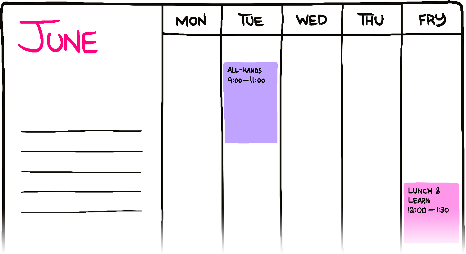
We need 6 columns: 1 wide column for the "metadata", and then 5 equal-width columns for each day of the week.
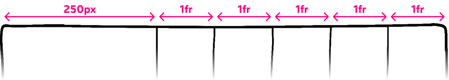
We could write out each column verbatim:
.calendar {
  grid-template-columns:
    250px 1fr 1fr 1fr 1fr 1fr;
}
This is fine, but it's an annoying bit of friction. It's also harder to tell at a glance exactly how many columns there are.
Fortunately, CSS Grid introduces a function that makes life a little bit easier:
.calendar {
  grid-template-columns: 250px repeat(5, 1fr);
}
We're saying that we should repeat the 1fr value 5 times. The end result is the same, but it's easier to read.
This is most commonly used with thefrunit, but it doesn't have to be! We can use any unit, like repeat(4, 200px).
Alignment
Grid Areas
grid-template-areas and grid-area are used to make the skeleton of the design.
<style>
.wrapper {
  display: grid;
  grid-template-areas:
    'sidebar header'
    'sidebar main-content';
  grid-template-columns: 250px 1fr;
  grid-template-rows: 80px 2fr;
}

aside {
  grid-area: sidebar;
}
header {
  grid-area: header;
}
main {
  grid-area: main-content;
}
</style>

<div class="wrapper">
  <aside>Aside</aside>
  <header>Header</header>
  <main>Main</main>
</div>
Designs are reflected in the grid-template-areas specifies the name of the grid-area.
Tracks and Lines
grid-column: left-column-number / right-column-number and grid-row: top-row-number / bottom-row-number are used to position the element to the specified column and box in the grid.
{
  grid-column: 3 / 4 or 3 /6;
  grid-row: 2 / 3 or 2 / 5
}
If grid-template-columns: 1fr 1fr then there will be two columns but what we want is just one column in the first row and two in the second row. We can do this using grid-column: 1 / -1 to the element which we want to extend in the first row. uncomment grid-style-2